 | ||
| World Map of National IQ Scores |
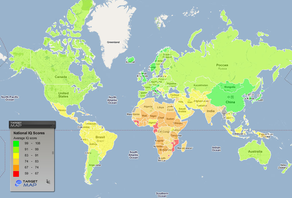
I found this map on a blog about "Maps They Didn't Teach You in School". The map is the product of a research done by a British Psychologist named Richard Lynn, based on national IQ scores of 133 countries. Not surprisingly, the more developed countries are labelled with higher average national IQ scores. This may be the result of better education sources. However, interestingly, in general, the smaller countries (that have smaller land) have the higher score than the larger countries. For example, Japan, South Korea, Norway, and the United Kingdom and several other countries have the highest score among all the countries displayed. They are followed by the larger countries such as the U.S. and Australia. The reason of this cannot be easily seen, but one possible explanation could be that with countries that have such large population, there are more educational inequalities that result in people with lower educational experiences holding the average scores low. Another interesting fact about this map is that countries that are near to each other geographically tend to have similar national IQ scores.
You can find this map at http://www.boredpanda.com/maps-they-didnt-teach-you-in-school/. The blogger did not specify the source of the map but only the scientists who did the research.
 |
| The Breast Cup Size Worldwide |
This map is also found in the blog mentioned above. It shows the average breast cup size of countries around the world. There is a Chinese stereotype stating that "those who have large breasts have slower brains." Interestingly, this map, when compared with the map presented above, shows no definite correlation between breast sizes and IQ scores. Some countries with large breasts even get high scores in the previous mentioned research. An example of this is the U.S.. With a large average size of "D", its IQ score is among the second highest of all the countries. Another interesting point is that unlike IQ scores, breast cup sizes are not necessarily similar for two adjacent countries. Brazil, for example, has a average breast size of "C" while its neighbor Bolivia scored only an "A", which is the smallest size of breast cups. The reason for this may be food and nutritional differences between the countries. The definite reason is not stated in the blog and therefore needs more investigation.
The map can also be found at http://www.boredpanda.com/maps-they-didnt-teach-you-in-school/. The data is retrieved from http://www.targetmap.com/viewer.aspx?reportId=5285, but the source of the map is not defined.
 | |
| The Map of the Wizarding World of Harry Potter Theme Park in Orlando, Florida. |
This is a 3D map of the theme park found on its official website. The map shows the relative relationships between the areas. This map is interesting in the way it presents both a fantasy and the reality. The map is surely a representation of the layout of the theme park, but at the same time, cartoons and ornaments are added onto the map to create a feeling of antiquity and mystery. This is similar of what professor Illes mentioned in class: that the ancient maps were often ornamented and labeled with dragons and other mysterious creatures because at that time, people did not have enough information of places they could not get to. Same applies for this map where the trees and the edges of the theme park are obviously not open to the guests.Another point is that this is a 3D interactive map, which gives the viewer clear understanding of each section of the theme park. Personally, this map has excited me and lit up my desire to pay a visit. This is one example how maps can be used as both a tool of guidance and a part of marketing strategy that helps build the brand.
I downloaded this map from the official site of the theme park with the following URL:http://www.universalorlando.com/harrypotter/.
No comments:
Post a Comment